Case study · 2026 · Wellness
Awear of Love.
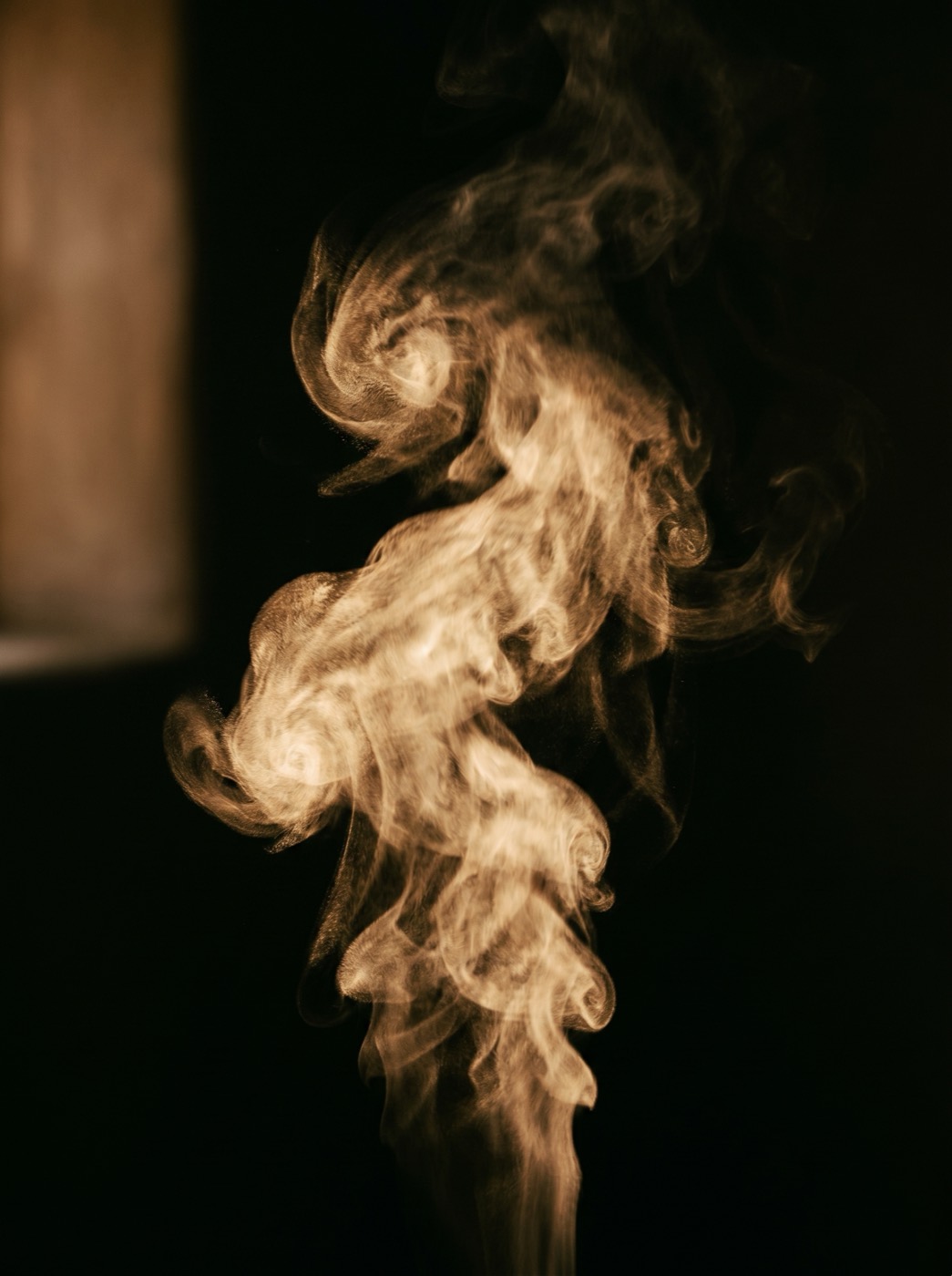
A pre-launch wellness brand whose method frames breath, motion and muscle as vibration. The redesign had to demonstrate that — not describe it.
01 · The brief
A template was selling a practice that is anything but templated.
Awear of Love arrived as a pre-launch site built on a page builder: borrowed stock imagery, two competing display fonts, and an aesthetic caught between meditation app and yoga studio. Nothing about it carried the weight of the method it was meant to sell.
The brand's claim is unusual — that breath, movement and muscle are vibration, not mechanics. A site that merely states that claim asks to be believed. A site that performs it earns the belief. That gap was the entire design problem.
02 · The thinking
So the decision was to make the page itself breathe.

The hardest part of any motion-led site is restraint. The easy path is variety — a different reveal per section, a different curve per interaction, decoration that accumulates until nothing means anything. That path produces sites that move a lot and say nothing.
The opposing decision: every motion on the page would share one rhythm — a single inhale-and-settle, tuned by hand, applied everywhere. Not as a constraint to work around, but as the argument itself. A visitor scrolling the page is, without being told, taking the breath the practice teaches.
Once that decision was made, every other choice followed from it. That is the value of a real concept: it stops being a description and starts making the decisions for you.
03 · Visual system
One palette. One type family. One register.
AaAaAa
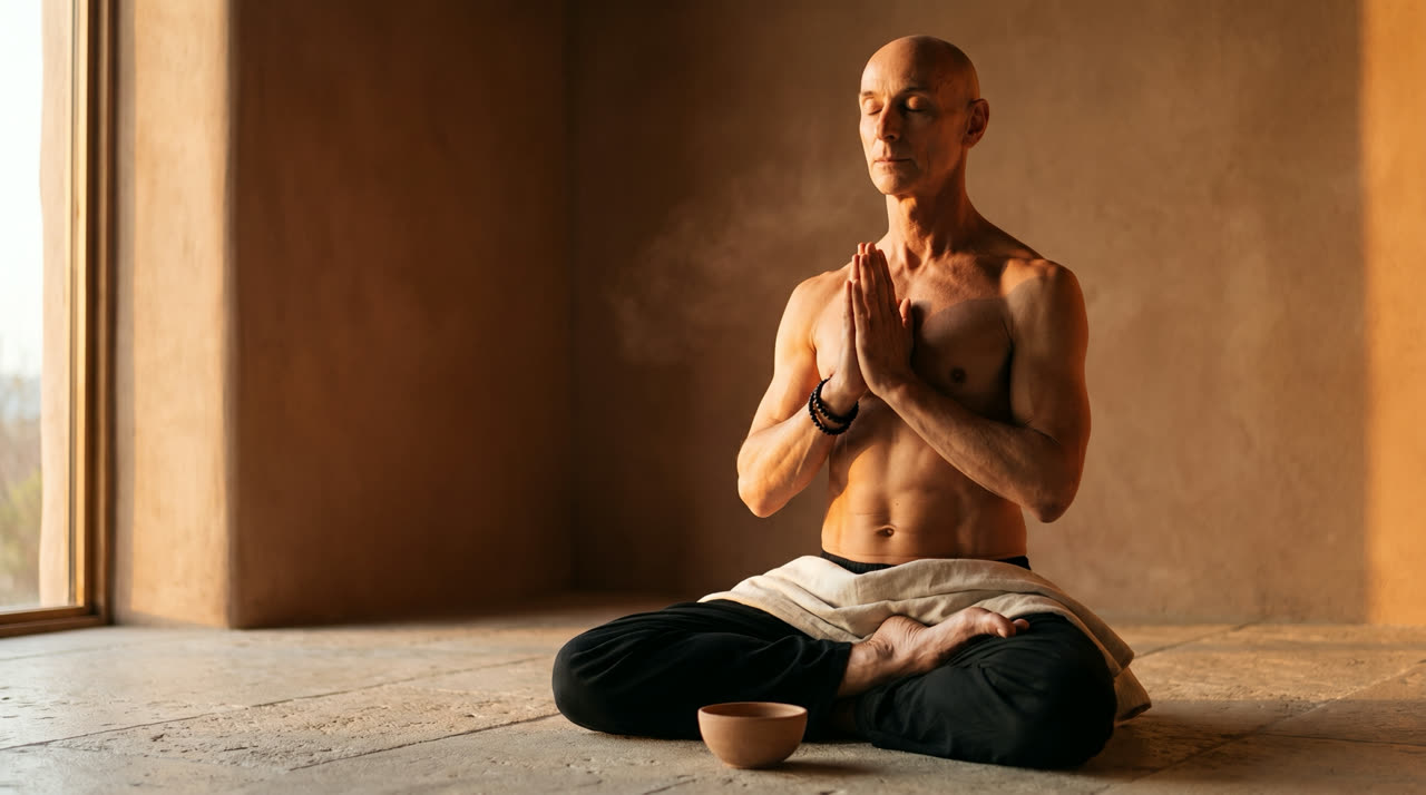
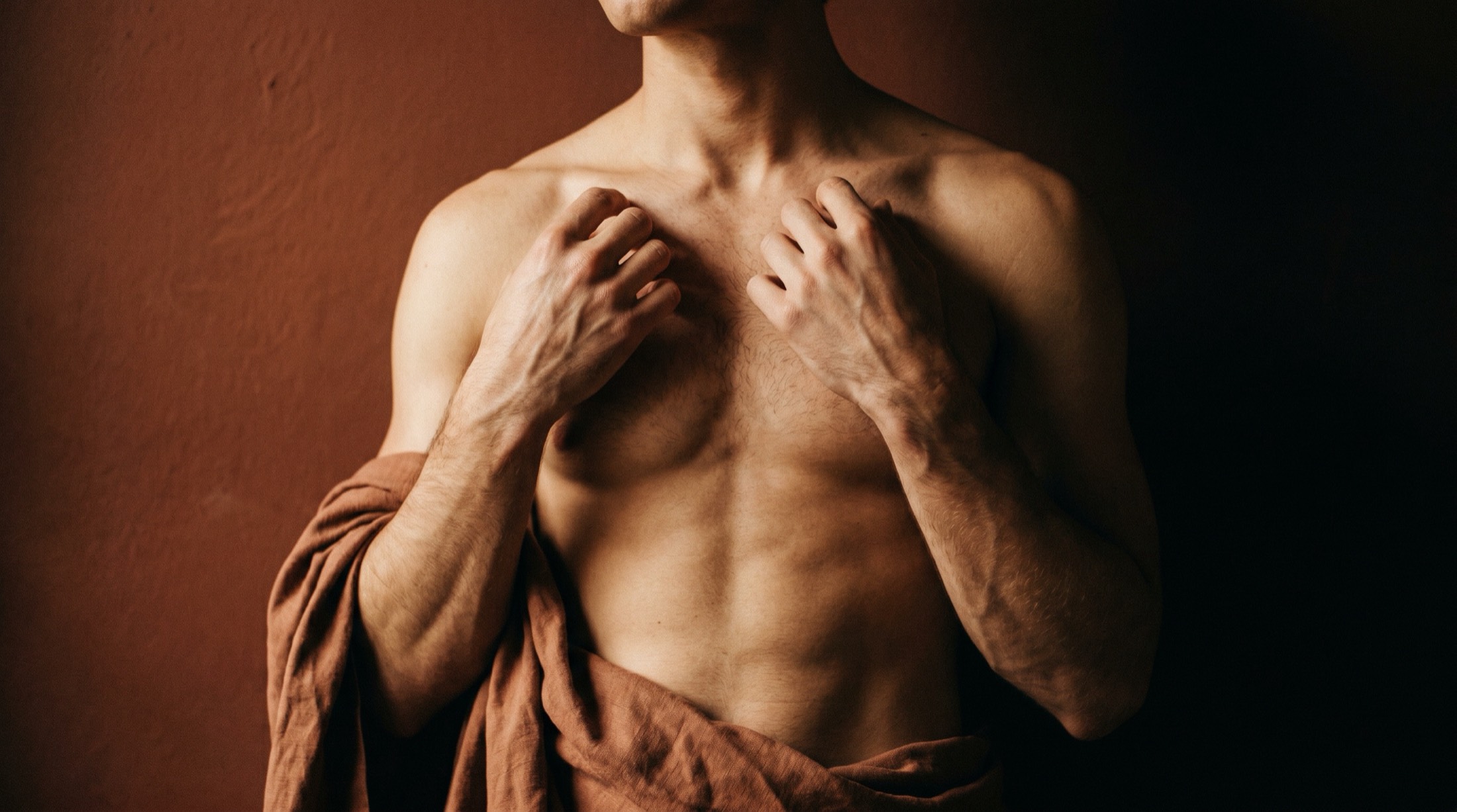
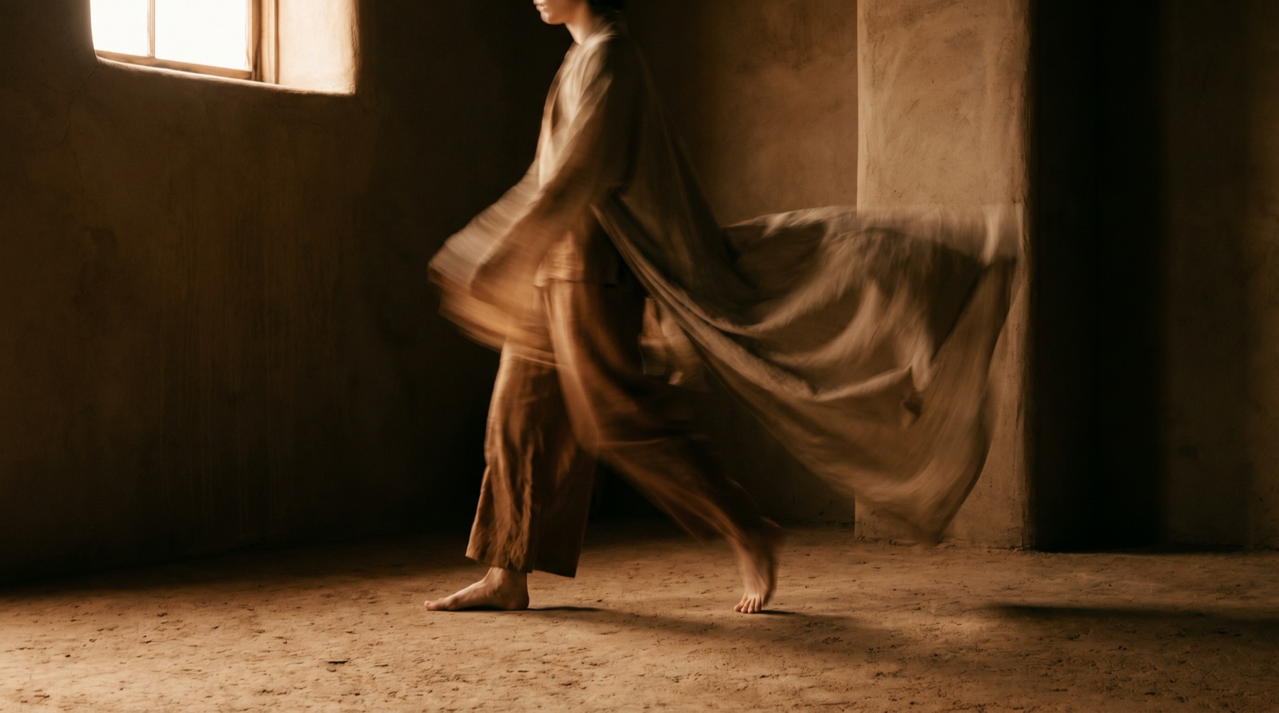
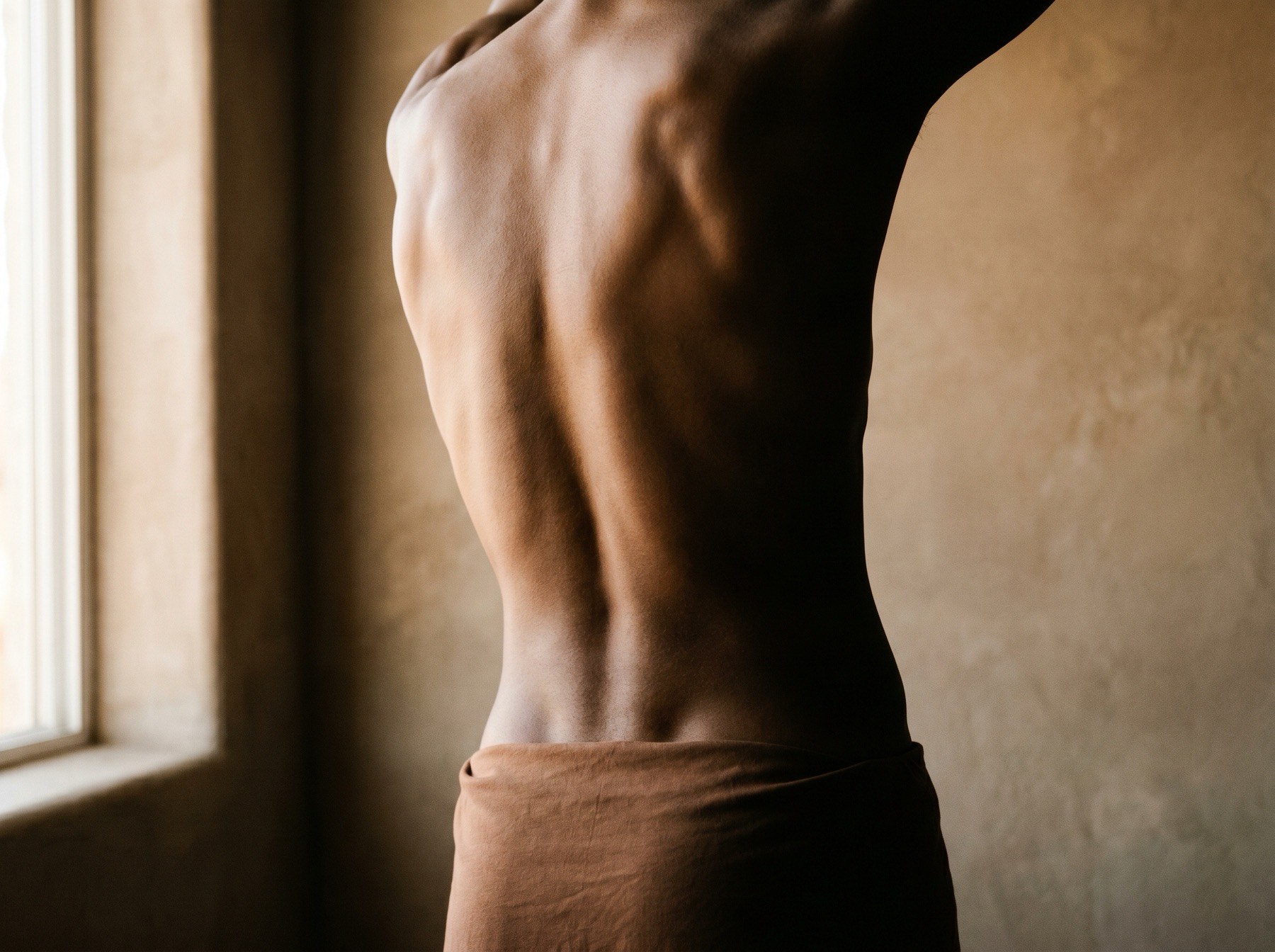
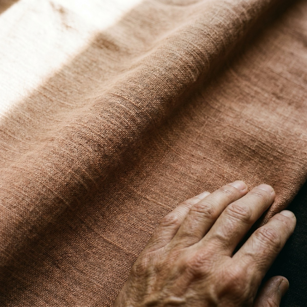
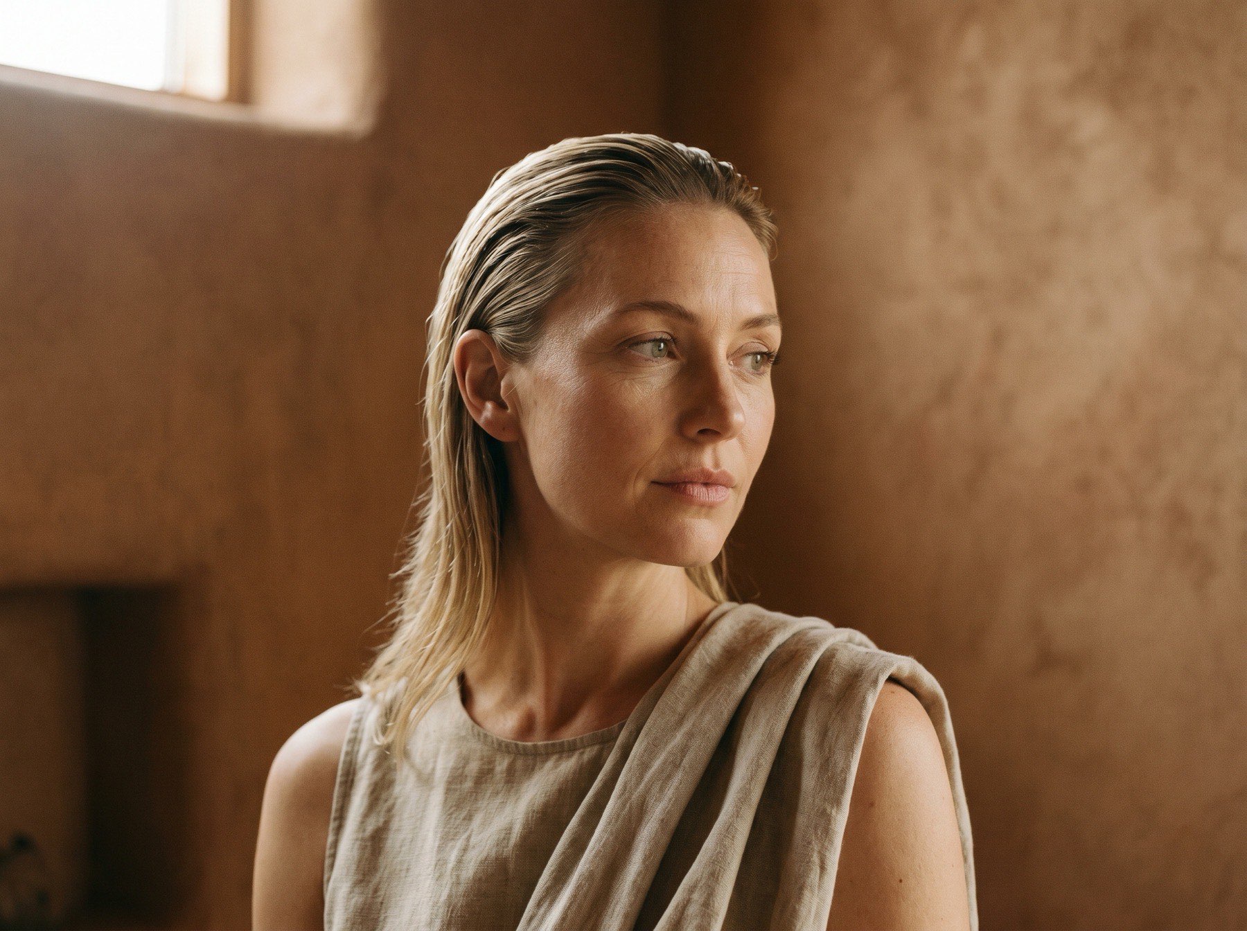
04 · Photography
No stock. No shoot. One directed body of work.
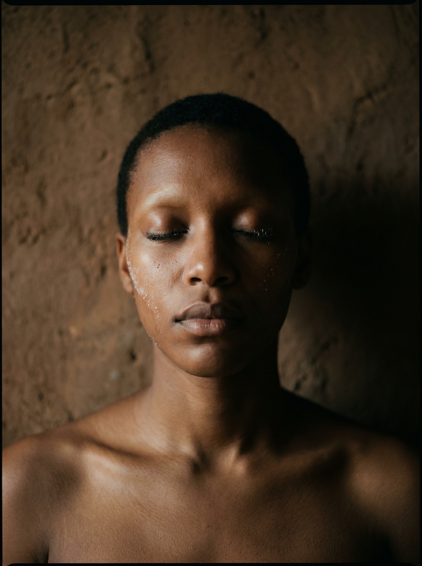
There was no photo library and no budget for a production shoot. Every image on the site was generated, then graded and finished by hand to a single light, a single room, a single body across one imagined afternoon.
The point worth keeping: the look was decided before anything was generated — the framing, the light, the restraint, the things the images must never do. Tools change. Direction is what makes a set of images feel like one hand made them.

05 · Built to convert
A felt sample pre-sells the practice before the ask.
The page has one job: turn an unfamiliar visitor into a waiting-list sign-up. The design does the persuading before the form ever appears — by the time the visitor reaches the ask, they have already taken the breath the practice teaches.
Everything points at one action. No competing buttons, no menu of choices, no exit ramps. A single CTA, repeated only where it earns the right. The page is not a brochure with a form bolted on — it is a conversion path that happens to be beautiful.
06 · Design decisions
The calls that carried the work.
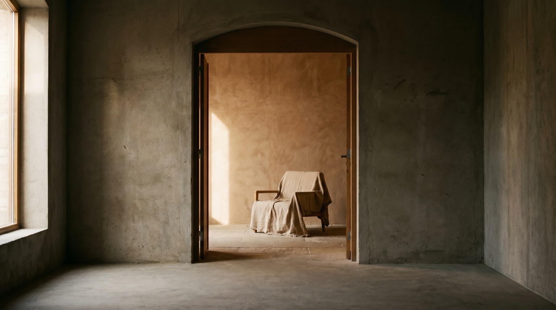
Full-bleed, then contained
The hero opens edge to edge, then contracts to a held card as you scroll. The image stops being a backdrop and becomes an object — looked at, not just seen past.
One family, three axes
A single variable typeface instead of a display-and-body pair. The letterforms soften as they arrive, so the type design is the animation — nothing bolted on.
Restraint over features
Several planned flourishes were cut after they were built. Every cut made the page calmer and the argument louder. The wow that survives is the one that carries meaning.
The phone is the real screen
The build was judged on a phone first. The signature moments were engineered to behave identically there — because that is where the practice will actually be met.
07 · How it ran
Diagnose. Direct. Build. Refine.
- 01DiagnoseRead what existed, name precisely what was wrong, and decide the one idea everything would answer to.
- 02DirectSet the world before producing anything — the light, the type, the rhythm, the things it must never do.
- 03BuildTranslate the direction into a single hand-built page. If a promise from the brief is not in the result, it does not ship.
- 04RefineCut. Tighten. Test on the device most people will actually use. Stop when nothing is left to remove.
08 · Outcomes
What shipped.
- Productionawearoflove.vercel.app
- One conceptBreath as motion grammar — carried end to end, undiluted.
- Original workEvery signature moment authored for this brand. Nothing template.
- Mobile parityThe full experience holds on a phone, not a reduced version of it.